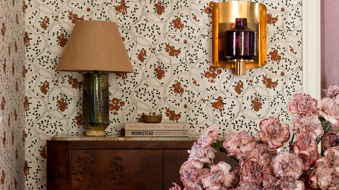
Here are some of my fundamentals when working with color and pattern
I do believe that once you instinctively understand color theory (or have the privilege of hiring someone who does), a color dwelling can feel as soothing as an all-neutral home. Colorful décor doesn’t have to be layered or loud or chaotic or daring or trendy; it can be nuanced and refined, which is how I personally like it.
Here are some of my fundamentals when working with color and pattern:
1.Utilize subtle color to create warmth in a space. My mother thinks I didn’t see the gulp she made when I told her that the ceilings throughout our entire home would be light pink, or that my office ceiling would be buttercream yellow. Once installed, though, the color was subtle enough that it did its job of adding depth and warmth. The pink ceilings read as creamy white in most lights, and my office ceiling is a true yellow only when all the lights blaze on. There are layers to the colors that create that subtlety, that cause you to look twice and not fully know why it feels “so cozy”!
2. Even for a maximalist, more is not always more. Restraint is more impactful than creating palettes with abandon. In one of my daughter’s bedrooms, there is a dusty pink floral wallpaper, and we painted all the doors and moldings in a light brown with hints of pink in it. While you may have thought I’d go for a contrasting color on the color wheel, monochrome can be your best friend when designing bold spaces. Here, utilizing restraint and choosing a focal point with a palette that bleeds into the rest of the room creates a thoughtful space.
Create a free account to keep reading.