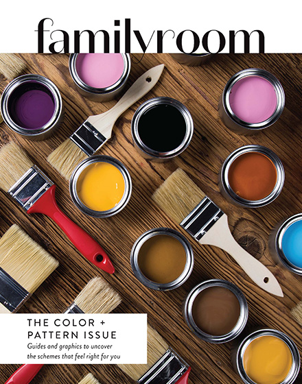
I’ve always lived my life in color, which I feel like comes as a surprise to no one. Which is why it is puzzling that I based our renovation of eight years ago around neutral, viewing them as the key to timeless décor. Colors were loud, trendy; I would grow tired of them, wouldn’t I? This restrained thought process followed throughout: walls awash in Benjamin Moore’s Stonington Gray (a wonderful light gray: quote me on that), and the cabinets were white. Soothing, right?
Wrong.
Our monochromatic palette did everything but soothe me — it distracted me. I felt misrepresented and, quite frankly, bored. Regardless of what those articles about trending colors say, paint schemes work well when they feel aligned for your tastes and lifestyle. That means you may feel homeostatic with neutrals, just as I feel calmed by color. Independent styling is the true hallmark of successful design.
There is a method to successful pattern combination and color execution, as much based on instinct as on principles. With mindfulness and restraint, you too can create a calming atmosphere in color. The articles in this issue, written by the best in their fields, delineate exactly how to do that.
Here’s my personal, nonnegotiable tip: There must be a flow. Seeing colorful rooms come to life without a scheme running from room to room is where pattern and color lovers go wrong. Reference the color of the kitchen chairs in the art of the dining room; scale the green floral powder room paper with green pin-striped throw pillows in the family room. As the ideas take shape, consider the sight line as you take in the full picture of each room.
Create a free account to keep reading.