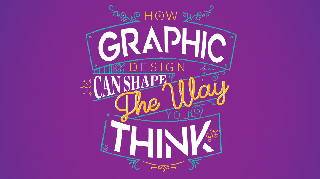
People often think of graphic design as art, as in, “I’m creative and love to draw so my friends think I should go into graphic design.” But in fact, effective design is more of a science. Mastering the theories of design allows designers to tap into a deep understanding of human nature to engage effectively with consumers.
While creativity and a strong aesthetic sense are important, what sets graphic design apart from fine art is its functionality, and its ability to sell products, solicit donations, or raise awareness. “Strategy first, execution second,” says Meny Hoffman, CEO of the Ptex Group, a Brooklyn-based marketing agency. “A well-conceived ad begins with an objective, which designers then communicate through a wide variety of techniques.”
While the principles of good design and the basics of human psychology are pretty much what they always were, an effective designer is also aware that audiences differ and tastes vary. Unlike the immutable laws of the hard sciences, people change, styles come and go, and what definitely worked in magazines in the ’90s may no longer be true in the web-savvy 2020s. So yeah, it’s an art too, not just science.

Which kid hasn’t been filled with a heady sense of liberation upon realizing that school reports didn’t have to be set in boring Arial or Times New Roman? That the family PC was preloaded with a whole library of fonts, each one gaudier and kitschier than the next (Papyrus or Mistral, anyone?)
That childhood delight we all remember stems from the discovery that we could control not only the content, but the style and vibe of our output as well.
With infinite subtlety, designers choose fonts from libraries of thousands — the MyFonts.com library boasts 130,000 choices!
Broadly, fonts are divided into two main categories, serif and sans serif. Serif fonts, with their useless but decorative little tails, were long considered more readable for large blocks of text, but recent research has begun to challenge that common wisdom.
Generally, serif fonts evoke a seriousness, tradition, old-school elegance, and a touch of luxury, while sans serif fonts are associated with modernity, simplicity, and approachability.
Within each category are any number of subcategories, such as old-style, slabs, and didones (serifs, all), and grotesques, humanists, and geometrics (sans). And that, of course, is aside from the scripts and displays.
Innocent bystanders’ eyes glaze over when designers begin to elaborate on the variable stroke widths of the font’s ascenders (the little up-strokes of letters like d or b) or the optimal kerning, but attention to these and similar details are all part of choosing the font most in sync with the message.
My brother once forwarded an article that described a certain software as containing “enough (fonts) for almost any practical purpose.” I took umbrage on behalf of my industry. You can never have too many fonts, and there is never more than one right font for any project.

Reds, yellows, and oranges — the colors of fire, autumn leaves, and glorious sunsets — are considered warm, energizing colors. On the opposite side of the color wheel, the blues, greens, and purples are cooler colors, associated with sky, water, and similarly calming natural tableaux.
Because in printing, as in life, colors are rarely a single pure pigment, but rather a mixture of others in varying proportions, and combining more than one color can lead to a variety of hues, shades, and tints.
By selecting the correct color, a designer can subconsciously evoke a particular association. Black is overwhelmingly associated with luxury and high-quality goods, red with speed, blue with reliability. Colors that are less popular, such as brown, orange, and yellow, are associated with cheapness.
But what if you’re an inexpensive luxury resort? Or a cafe specializing in organic fast food? Judicious mixing and combining of colors allows designers to convey nuanced shades of meaning (see what I did there?), which brings us interesting phenomena like warm blues and cooler reds. For example, an icy blue might be perfect for the professional, precise IT company; the doctor who is state-of-the-art, but prides himself on his human touch would probably mix some yellow into his blue.
Aside from choosing whether the words should be green or purple, the designer determines the overall feel of the page through the color scheme. Muted, monochromatic choices lead to feelings of calm and seriousness, while brighter, more saturated values promote feelings of energy and spirit.
In addition to setting the emotional tone of the project, color can also be used to direct the eye to more important information, by highlighting it in high-contrast colors. Introducing a complementary color, or one that is on the opposite side of the color wheel, is simultaneously harmonious and eye-catching.
While color’s effect on people has been well-documented — studies show, for example, that a driver blocked by a red car will react more quickly and aggressively — the exact way people respond to a given color depends largely on cultural context. In China, red is the color of luck and is worn to weddings; in South Africa, it’s a mourning color. That’s why it’s important to study your audience before planning the worldwide launch of that brand of luxe paper goods.
You know how real estate agents tell you to take down family pictures before showing your house, so prospective buyers can see themselves in it? Graphic designers know that the secret to effective advertising is allowing readers to see themselves in the ad.
In the single biggest shift in the world of frum marketing, stock photos are out and photo shoots, carefully costumed and art directed for 100 percent authenticity, are in, says Ahuva Hoberman of Neon Design Co. Gone are the days of trying to pass off a bearded hipster as a yeshivah guy; today, the little girl in the ribbed set cues the viewer that this is where people like her shop.
In a highly successful campaign for a prominent tzedakah organization, the Ptex Group segmented their market carefully. Not only were all the people featured in the ads frum, but Boro Park ads have featured men with long peyos, while other communities got knitted yarmulkes or other variations. “We want the target audience to say, ‘They’re talking to me,’ ” says Mr. Hoffman. We’re all Yidden and they’re all our brothers, but we dig a little deeper into our pockets when people look like us.
Create a free account to keep reading.