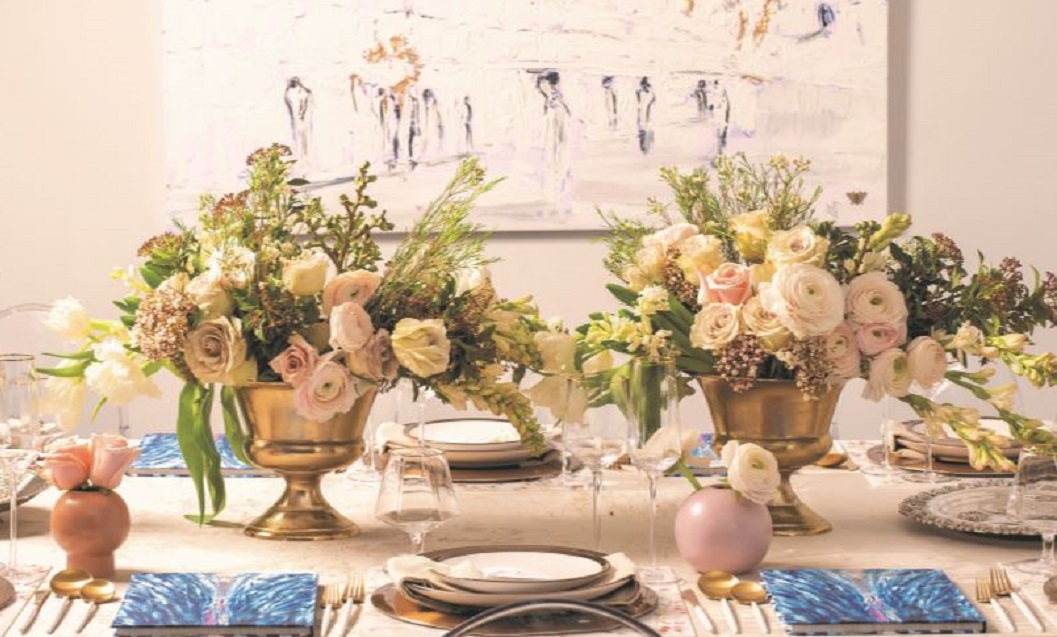
A timeless look of creams, beiges, and everything in between, will never go out of style.
Photography by Hudi Greenberger
Although splashes of color are eye-catching and vibrant, nothing says chic like a soft, muted color palette of neutrals. Peaceful and classic, shades of beige, ivory, and white stand the test of time. With all the time and effort that goes into making Pesach, I wanted this table to be easy to replicate. The neutral color palette can easily blend with your home decor, allowing you to set your Seder table with minimal effort.
The artwork on the wall blends with the soothing colors on the table. The Kosel image is perfect for the Seder, which we hope to celebrate this year in Yerushalayim.
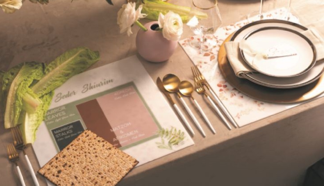
When I think of a Pesach table, after the obvious ke’arah and kosos, my mind goes to the shiurim chart that graces most of our tables. I wanted to create a shiurim chart that would be both beautiful and functional. This shiurim placemat has a dainty floral motif on one side and a chart in coordinating colors on the other. It’s made out of Lucite, ideal for the Seder when we expect the usual wine and grape juice spills.
Why is this place card different from all the other place cards? It can also serve as a bookmark for your Haggadah. Punch a hole at the top of each card, loop a ribbon through, and write your guest’s name on the front. I love how they coordinate with the floral motif of the placemats.
Create a free account to keep reading.